Product Design

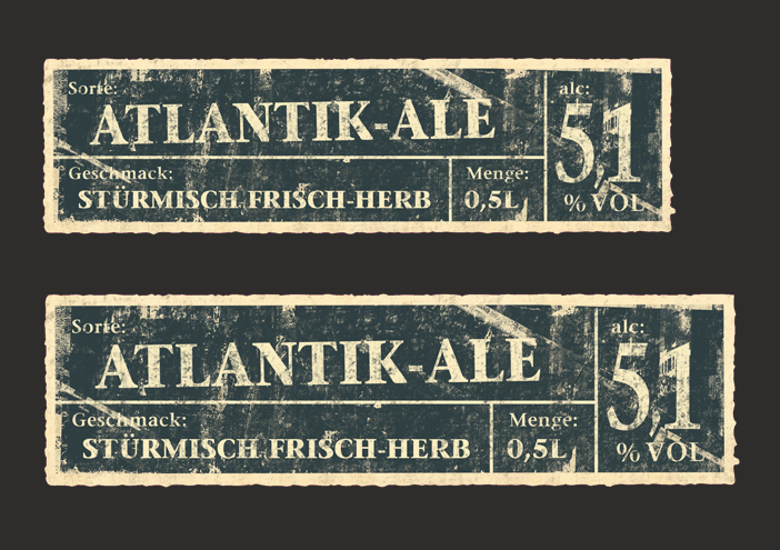
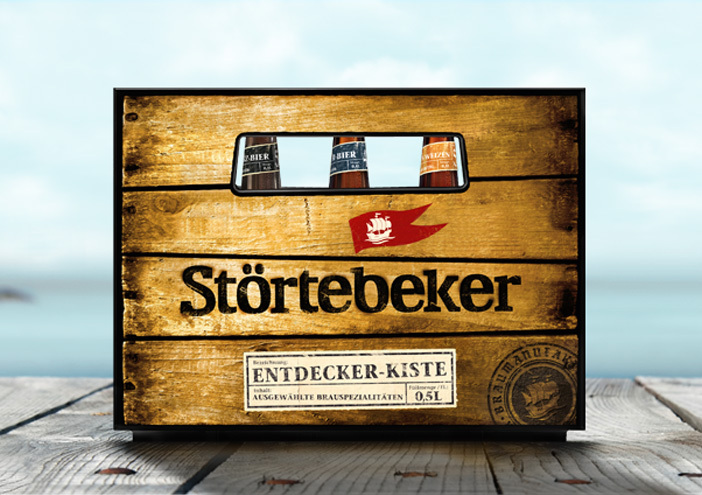
Störtebeker beer specialties

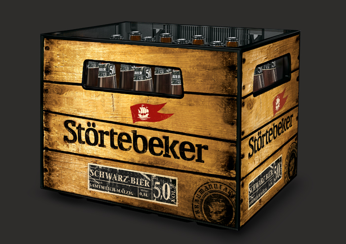
The award-winning beer crate (German Packaging Award & World Star 2013) depicts an authentic surface of an old wooden box which was produced through the in-mould-process. The trade mark - a red flag - is positioned above the lettering that visually gives the illusion of being burnt into the box. A paper label informs about the individual varieties.

Zurück zur Übersicht
Stoertebeker stanzform
Stoertebeker stanzwerkzeug
Stoertebeker sortenlabel
Stoertebeker bierkiste packaging
Stoertebeker kiste seitlich

Product Design

further interesting projects

kunstschule-wandsbek.de

kunstschule-wandsbek.de UI/UX-Design

Communication on eye-level is the overall motto! Direct quotes and snapshots of the everyday life at the KW shape the website. Together with a new logo developed...

Störtebeker Brauquartier - Sudhaus

Störtebeker Brauquartier - Sudhaus Interior Design

In der Braumanufaktur von Störtebeker kann man Bier genießen – und verstehen. Im alten Sudhaus, das von wertmarke neu gestaltet wird, startet...

Design-Premiere: Störtebeker  erobert die 0,5l-Dose

Design-Premiere: Störtebeker erobert die 0,5l-Dose Packaging

Erstmals bringt Störtebeker Brauspezialitäten zwei Sorten in die 0,5l-Dose – und wertmarke entwickelte das passende Packaging-Design...

Störtebeker Brauspezialitäten

Störtebeker Brauspezialitäten Corporate Design

The connection of the past and presence works as the foundation for the relaunch of the brand "STÖRTEBECKER Brauspezialitäten" (brew specialities). Wertmarke develops the key- visual, a cog on the rough sea, as a symbol for the myth...

get in touch with wertmarke

Contact

wertmarke hamburg GmbH
Alte Druckerei
Bahrenfelderstr. 73b

D-22765 Hamburg

Inquiries