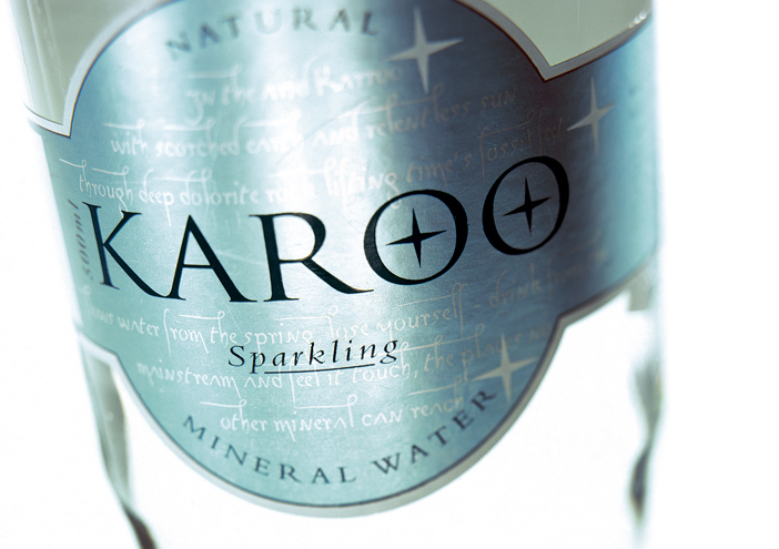
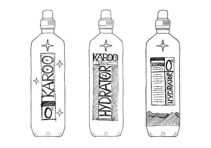
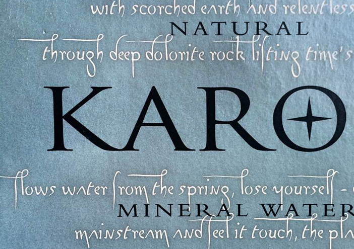
Packaging

KAROO Wasser

Wertmarke is instructed to develop a new packaging concept for the South African mineral water KAROO. The name reflects the product and thus it is mandatory to communicate the purity and quality of the well located in the South African desert in the design. Today, KAROO is the market leader upon the various upscale water brands in South Africa.

Zurück zur Übersicht
Karoo pet flasche
Karoo typografie
Karoo sixpack

packaging concept

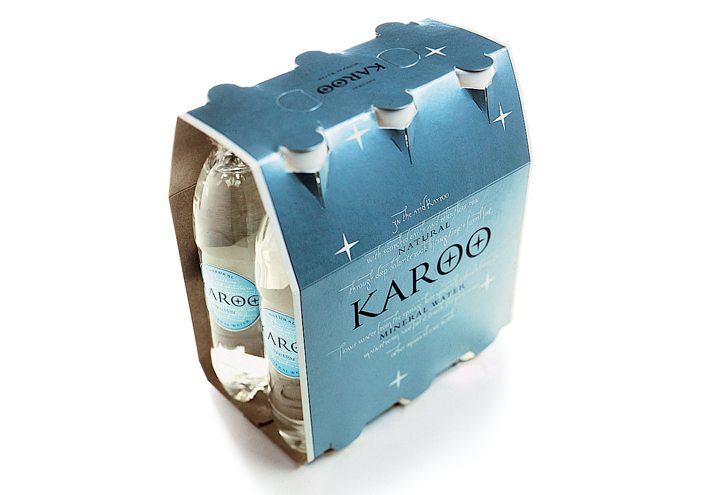
The main parts of the design that belong to the water‘s image are the connection of the symbolism "Star of the South", a poem about the desert Karoo and the logo. The cool and clear color palette in combination with the metallic components support the aspects of quality and purity. By now the "water from the desert" can even be purchased in Germany - for instance at the traditional hotel "Hotel Adlon" in Berlin.

1404x990
Karoo etikett

Packaging

further interesting projects

PROBIO Gewürzmanufaktur

PROBIO Gewürzmanufaktur Packaging

The typical tin plate containers that were specifically developed for PROBIO were introduced in different packages. The traditional brand PROBIO, founded in 1954...

Kunstschule Wandsbek

Kunstschule Wandsbek Corporate Design

Communication on eye- level is the motto of the School of Arts in Wandsbek.„ Direct quotes and snapshots of their everyday life shape their broshures, website....

Design-Premiere: Störtebeker  erobert die 0,5l-Dose

Design-Premiere: Störtebeker erobert die 0,5l-Dose Packaging

Erstmals bringt Störtebeker Brauspezialitäten zwei Sorten in die 0,5l-Dose – und wertmarke entwickelte das passende Packaging-Design...

scoyo

scoyo Corporate Design

Wertmarke develops the coporate design for scoyo, a project from Bertelsmann AG. For their e-learning platform online a new logo and popular figure, which is...

get in touch with wertmarke

Contact

wertmarke hamburg GmbH
Alte Druckerei
Bahrenfelderstr. 73b

D-22765 Hamburg

Inquiries