The coporate design guidelines for the new face of the Commerzbank were given according to their motto "ideas forward". In this process wertmarke edits all print media, defines future guidelines...
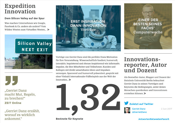
The web presence for Gerriet Danz, one of the most acknowledged presentation and media coaches in Germany. "The brand appearance should be as extraordinary as my workshops...