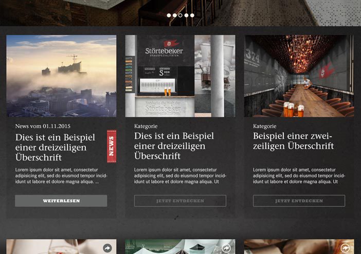
The Störtebeker Showroom is located in the modern annexe to the existing historical brewery. Room elements and furniture were designed which combine ordinary europallets with steel and concrete. Besides the pure...
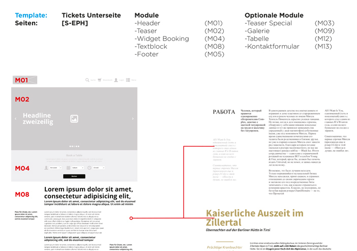
Zeit ist kostbar – und jetzt auch digital erlebbar. wertmarke entwickelte
für Jonas Geissler eine barrierefreie, responsive Website, die seine
Botschaft perfekt transportiert.
In einem 18-monatigen Markenbildungsprozess entwickelt wertmarke die neue Dachmarke „Binzer Bucht“ mit den Submarken „Binz“ und „Prora“. Entstanden ist ein Corporate Design für den...