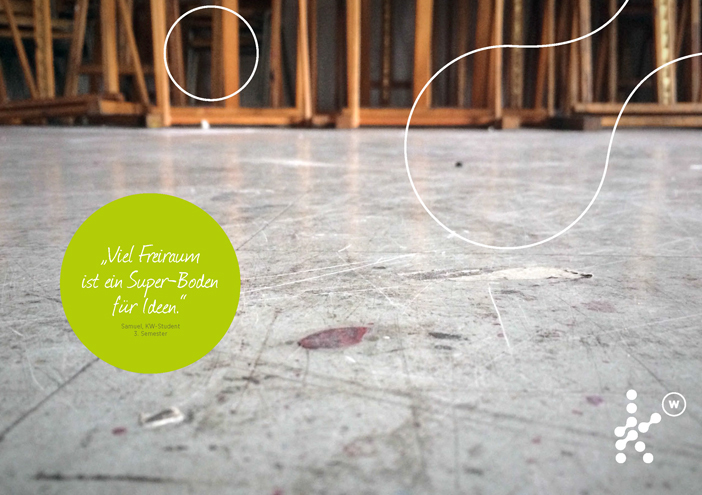
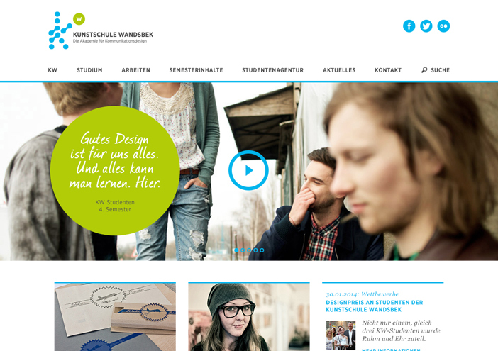
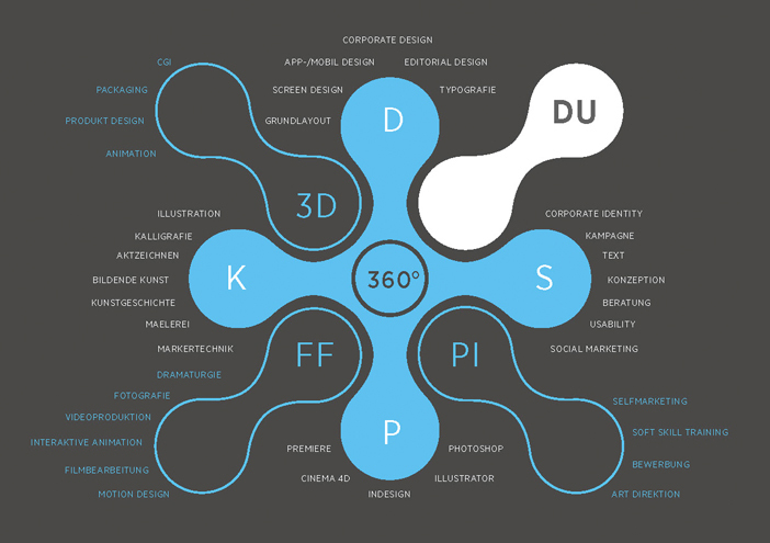
UI/UX-Design

kunstschule-wandsbek.de

Communication on eye-level is the overall motto! Direct quotes and snapshots of the everyday life at the KW shape the website. Together with a new logo developed by wertmarke the KW visually presents its character: The interaction of individuality and teamwork.

Zurück zur Übersicht
Kunstschule wandsbek web1
Kunstschule wandsbek web6
Kunstschule wandsbek web2

concept

What distinguishes the KW from other schools in Hamburg and Germany are the dimensions, possibilities and the diversity of offers. In order to communicate this great difference, the design concept of their website is based on a clear structure in connection with a large amount of imagery.

1404x990
Kunstschule wandsbek web7

UI/UX-Design

further interesting projects

CANUSA

CANUSA Corporate Design

CANUSA, den Marktführer für Nordamerikareisen, unterstützt wertmarke mit einem sanften Facelift des Logos, einem...

Eisbock

Eisbock Packaging

wertmarke kreiert die schönste Bierflasche der Welt! Zu diesem Schluss kommt die Jury des Worldstar Packaging Award 2018...

Störtebeker Single Malt Whisky

Störtebeker Single Malt Whisky Product Design

For Störtebeker‘s Single Malt Whisky wertmarke designs a packaging in vintage style - from the covering box to lasered wooden closure. Together with a stamp "Matured in oak barrels" the whole design depicts...

Tiffin Loop - Plastic free take-away!

Tiffin Loop - Plastic free take-away! Corporate Design

Unter dem Namen TIFFIN LOOP startet ECO Brotbox Berlin gemeinsam mit wertmarke und weiteren Unterstützern eine bundesweite Initiative, die einen plastikfreien Transport des Lieblingsessens vom Restaurant nach Hause oder zur Arbeit verspricht.

get in touch with wertmarke

Contact

wertmarke hamburg GmbH
Alte Druckerei
Bahrenfelderstr. 73b

D-22765 Hamburg

Inquiries