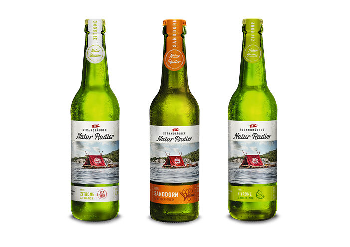
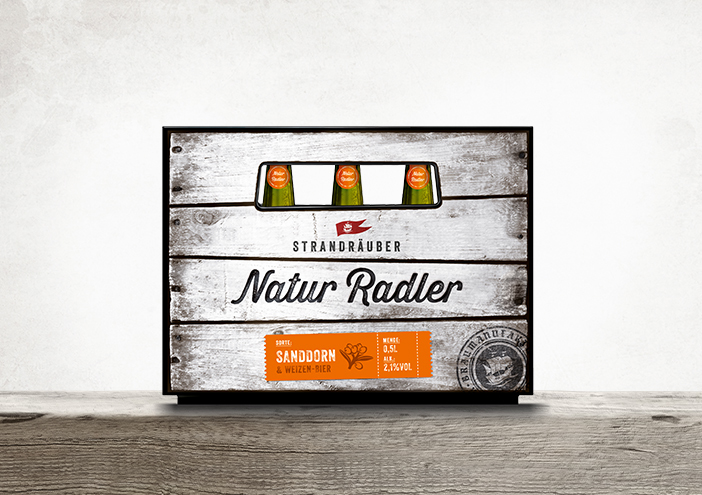
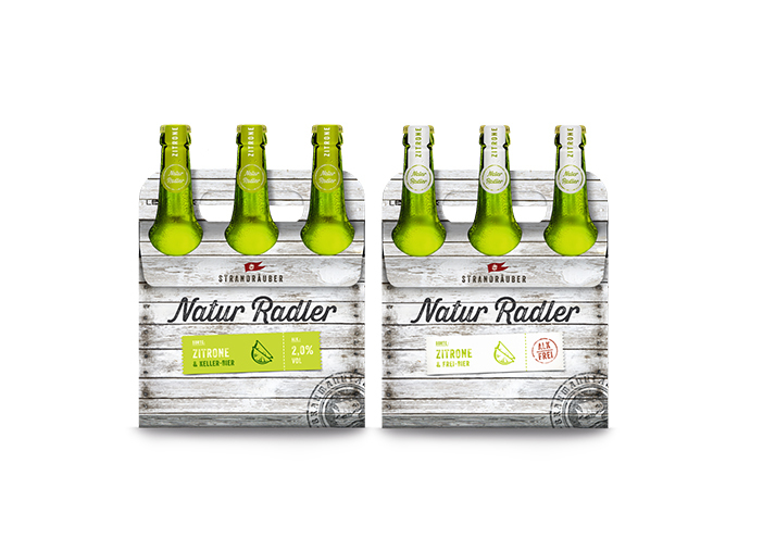
Packaging

Sieht nach Abenteuer aus:
Das Natur Radler-Sixpack

Aus der Störtebeker Braumanufaktur kommen immer wieder erfrischende Ideen, die wertmarke gern mit einem authentischen Design beantwortet. Für das Strandräuber Naturradler wird als Keyvisual ein rotes Zelt auf einem Floß aufgeschlagen. Der Beginn einer abenteuerlichen Geschichte, die wertmarke mit dem Sixpack-Verpackungsdesign in Treibholzoptik fortsetzt.

Zurück zur Übersicht

Designkonzept

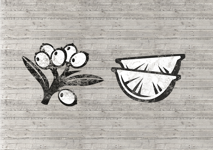
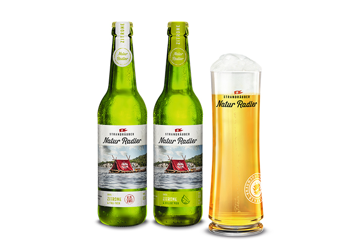
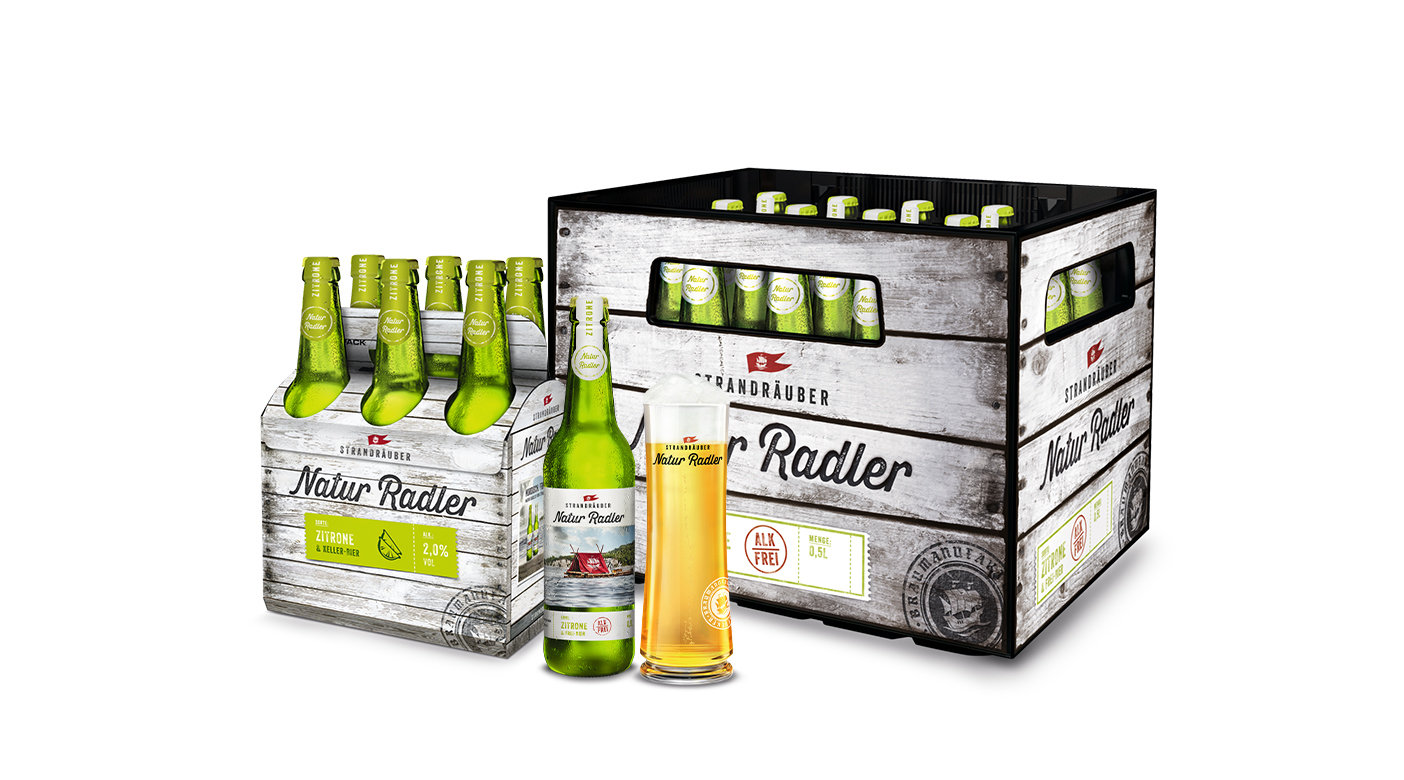
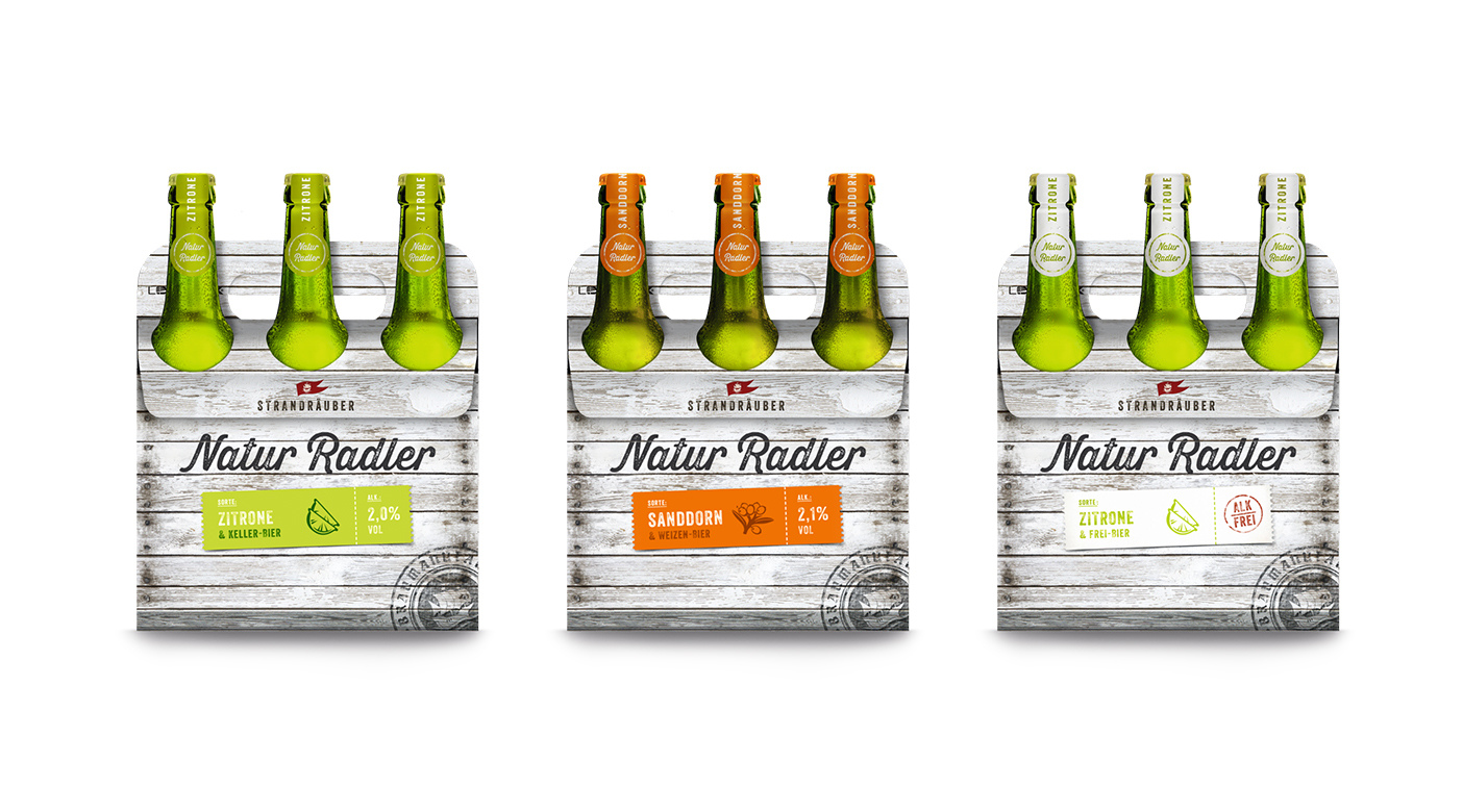
Natur Radler – der Name des Getränks zieht sich in schwungvoller Handschrift wie ein persönliches Statement über Flaschenetikett und Verpackung. Die Siegel und Aufkleber in drei Farben weisen den Weg zur gewünschten Sorte, die durch drei Icons illustriert wird. Der Radler-Familie Zusammenhalt gibt das Floss, das sämtliche Flaschen ziert und Strandräuber-Feeling aufkommen lässt.

1404x990
Gruppe 10
Gruppe 12 kopie
Gruppe 22
Gruppe 23
Gruppe 21
Gruppe 24

Packaging

further interesting projects

kunstschule-wandsbek.de

kunstschule-wandsbek.de UI/UX-Design

Communication on eye-level is the overall motto! Direct quotes and snapshots of the everyday life at the KW shape the website. Together with a new logo developed...

Taste & Shop

Taste & Shop Interior Design

KAROO Wasser

KAROO Wasser Packaging

Wertmarke is instructed to develop a new packaging concept for the South African mineral water KAROO. The name reflects the product and thus it is mandatory to communicate the purity and quality of the well...

Chilinoff

Chilinoff Packaging

Dr. Chilinoff who is a Russian partisan functions as the leading figure in the brand identity of the mixed beer beverage Chilinoff. Through the rough packaging design...

get in touch with wertmarke

Contact

wertmarke hamburg GmbH
Alte Druckerei
Bahrenfelderstr. 73b

D-22765 Hamburg

Inquiries