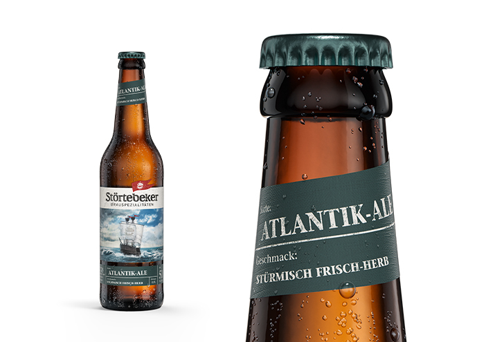
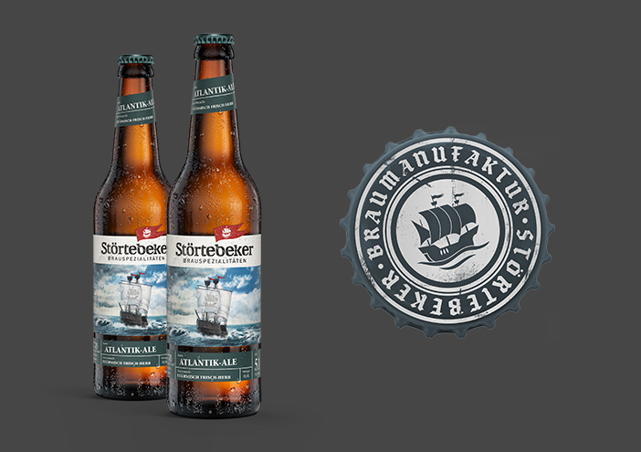
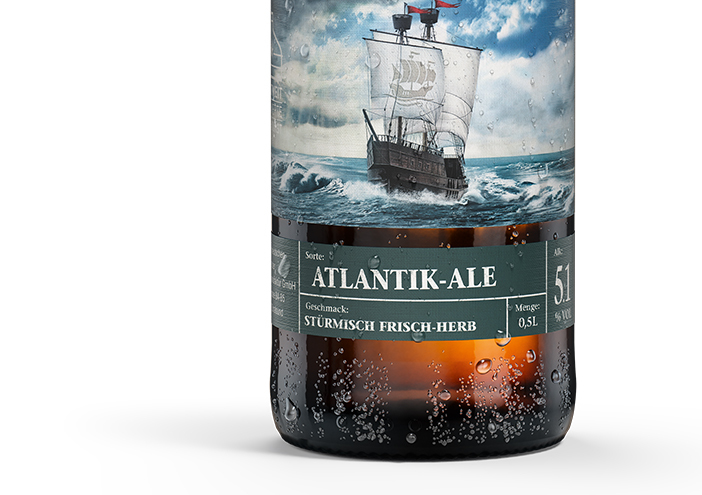
Packaging

Störtebeker Brauspezialitäten

The new packaging concept in combination with the North German key visual of a cog on the rough sea and the red Störtebeker-flag causes an authentic overall impression. The myth is blended into a visual world which binds the past and present in a vivid way.

Zurück zur Übersicht
Unbenannt 1
Unbenannt 6
Unbenannt 2

Packaging concept

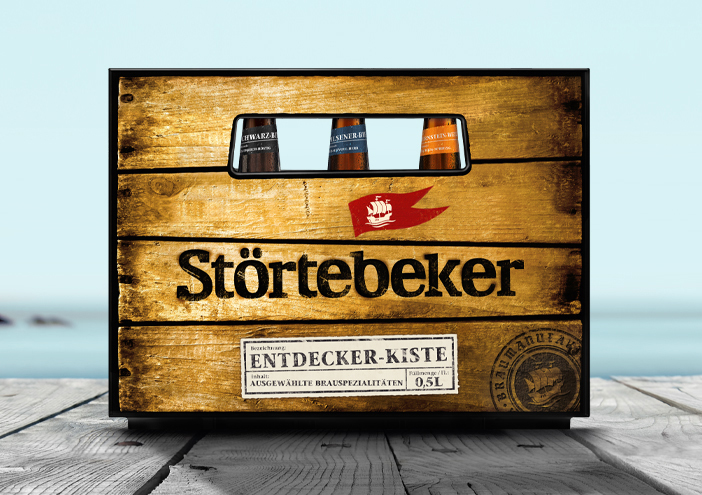
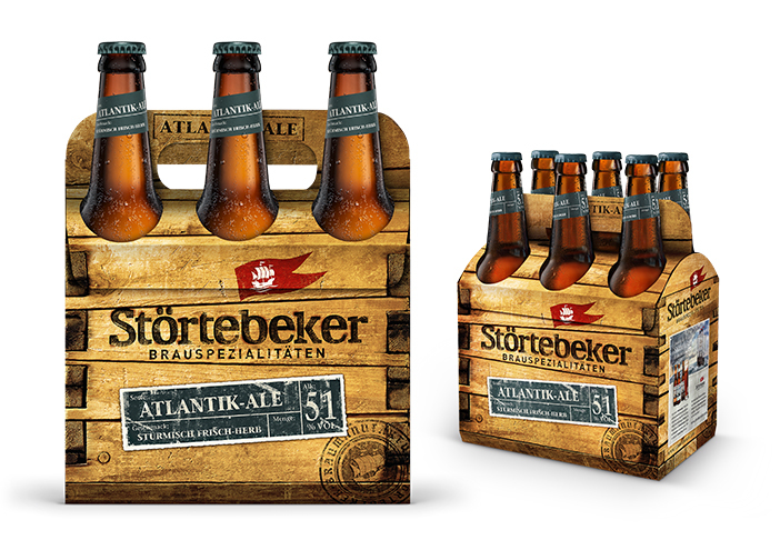
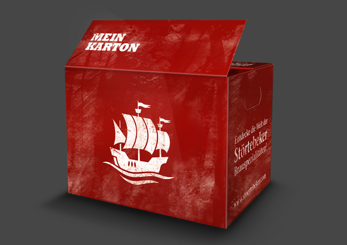
In order to allow a high flexibility in the development of new innovative beer brands, an individual concept of colors was chosen. A vast range of gift sets that conduct the nordic character add to the merchandising sector of the manufactory. The newly developed beer crate by wertmarke received a very positive feedback and was priced by several national and international design juries. Within a few months the beer crate was out of stock, as costumers liked to keep it at home.

1404x990
Unbenannt 3
Unbenannt 4
Stoertebeker mein karton
Unbenannt 5

Packaging

further interesting projects

Störtebeker Whisky

Störtebeker Whisky Packaging

Für die Störtebeker Whisky-Kategorien KLASSIK & LIMITIERT kreiert wertmarke ein neues Packaging und Corporate Design...

KAROO Wasser

KAROO Wasser Packaging

Wertmarke is instructed to develop a new packaging concept for the South African mineral water KAROO. The name reflects the product and thus it is mandatory to communicate the purity and quality of the well...

kunstschule-wandsbek.de

kunstschule-wandsbek.de UI/UX-Design

Communication on eye-level is the overall motto! Direct quotes and snapshots of the everyday life at the KW shape the website. Together with a new logo developed...

Visueller Auftritt für ein bundesweites Bier-Event

Visueller Auftritt für ein bundesweites Bier-Event Corporate Design

Das Logo in den Nationalfarben lässt keinen Zweifel: Störtebeker sucht den den besten Hobbybrauer – und zwar bundesweit...

get in touch with wertmarke

Contact

wertmarke hamburg GmbH
Alte Druckerei
Bahrenfelderstr. 73b

D-22765 Hamburg

Inquiries