Fass No. 1 – Design für ein nordisches Original
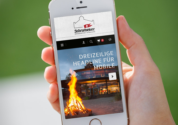
Packaging
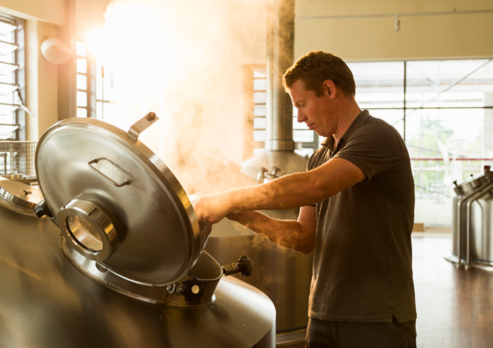
Wenn ein Whisky Premiere feiert, der mehr ist als nur ein Getränk, braucht es ein Design, das diesem Anspruch gerecht wird. Für die Störtebeker Brennerei hat wertmarke mit „Fass No. 1“ ein markantes Produktdesign entwickelt – klar, reduziert und voller Charakter.
Aus einem Reststoff wird ein Rohstoff. Aus einer Technologie wird eine Haltung.
Für das Start-up EAT BEER Biotech entwickelte wertmarke ein präzise abgestimmtes Corporate Design, das nicht nur den technologischen Anspruch des Unternehmens visualisiert, sondern auch seine Vision von zirkulärer Wertschöpfung konsequent transportiert.